Written and Created by Erica Simek Sloniker, GIS & Visual Communications Specialist
How many times have you heard the saying “a picture is worth a thousand words”?
Scientific research can back this up and has shown that humans process visual information much more rapidly than pure text. It is no surprise then that infographics that combine art with science are helping present data and scientific concepts in memorable and easy to understand ways.
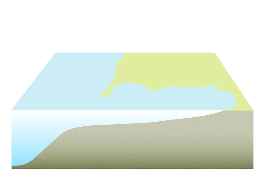
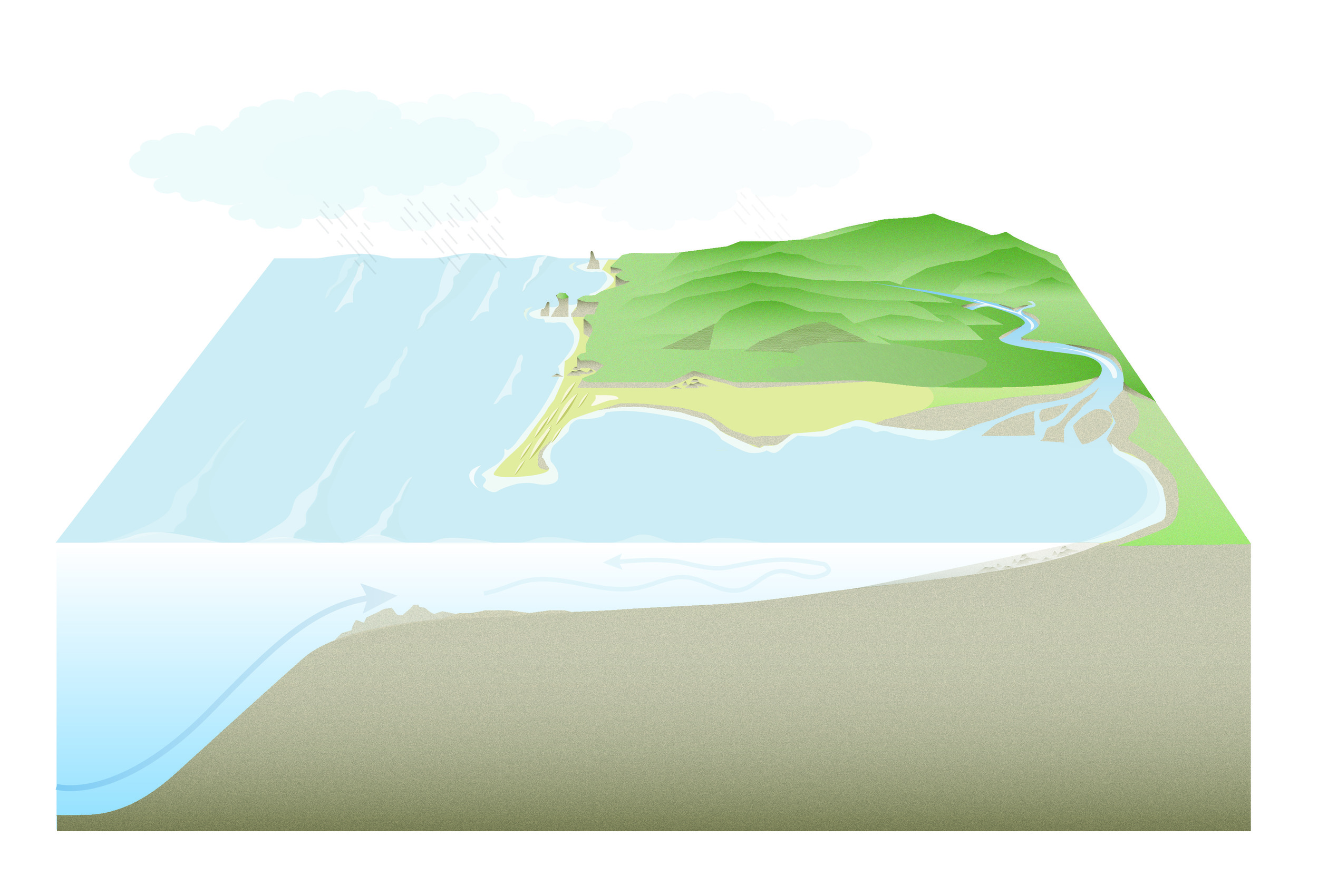
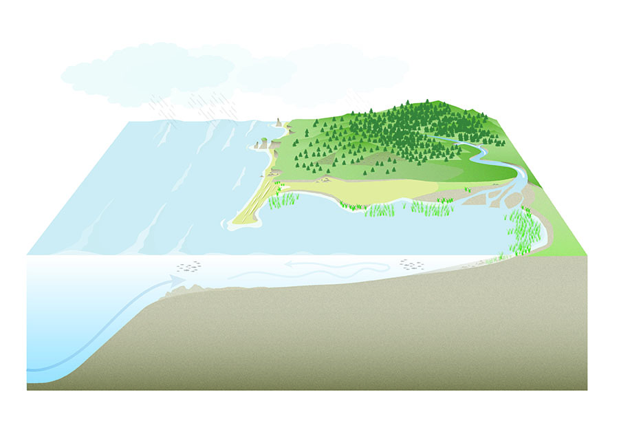
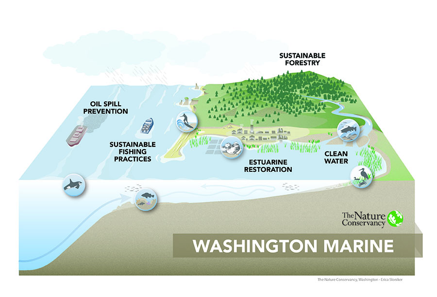
I make maps and illustrations for The Nature Conservancy. Let me introduce you to my most recent creation, an illustration about The Nature Conservancy’s marine conservation goals. In this slideshow, I will take you step-by-step through the artistic and conceptual decisions made in its creation in order to leave you with a better understanding of the drivers behind our marine conservation program.
Find out how this infographic was made in the interactive slideshow above!